This content contains affiliate links. When you buy through these links, we may earn an affiliate commission.
In April, I rounded up some of the best book covers of 2024 so far. Those were for books that published between January and the end of April. I then revisited the best covers for books published between May and the end of July, highlighting several fantastic and memorable works of literary art. Now, let’s feast upon the books published between August and the end of October and the dynamic covers that stand out from among the crowd.
Book cover design is interesting because it’s got to play to some trends, got to play to some conventions of genre and age category, and because it’s got to play to consumer tastes. We need book covers to sell a book — it’s the number one marketing opportunity for any title. But we need those covers to also give insight into the story and to be nice to look at and to be easy to render on mobile.
Important to all of this is the team behind the cover’s creation. For too long and still to this day, cover designers and artists are rarely credited for their work. The time it takes to find this information is embarrassing in 2024, and still, many of the covers you’ll see below don’t have this information available. Publishers still don’t put it on the landing pages for these books, so it takes good Googling and a lot of luck to dig up names to credit. Unfortunately, this also makes it easier for AI-generated art to get through to book covers, which we have already seen this year.
In this third best covers roundup for the year, I’ve done my best to credit artists and designers, and those without are not left off as a slight. For the sake of space, time, and, well, because this is a post about book covers and not necessarily the book contents, I’ve not posted descriptions of the books but short thoughts on what makes the cover stand out. You can grab the book description by clicking the link.
These covers are only for adult fiction (and this roundup has a couple of works of adult nonfiction, too). There are certainly whole posts with more rad covers for YA books and middle grade books and children’s books, and so on.
Even More of the Best Book Covers of 2024 So Far
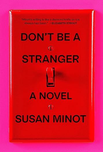

Don’t Be A Stranger by Susan Minot
Though it is simple, the bright red light switch and switch plate cover against the neon pink background are knock out in terms of attention-grabbing. The way the title and author text are set is also clever and reminiscent of a fire pull station.
Interesting, this isn’t the only cover to have gone this sort of route recently. You may call to mind the less-vibrant but still pretty damn evocative cover for Gillian Anderson’s Want.
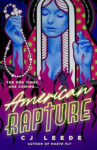

American Rapture CJ Leede, Cover art by Carly Janine Mazur, cover design by Christine Foltze
The design on this is pulpy enough not to feel like it’s taking the religious iconography too seriously but also doesn’t undercut that it is religious iconography. The almost-crossed fingers are clever against the stigmata, and the font for the title has a very neon-lights vibe to it. This cover reminds me a lot of Scorched Grace by Margot Douaihy. The colors even have some synchronicity.


Blood Test: A Comedy by Charles Baxter
There is a lot going on with a cover that has, ultimately, very little going on. The creamy color base is pretty nondescript, but then you add the bold red lettering of the title and author. Those pop, just as much as the “a comedy” pops as well—laying that text right next to what appears to be either a snow globe or crystal ball with a curious mouse inside really does indicate to the readers what to expect here. It’s serious enough to be a blood test but it’s actually kind of funny, too.
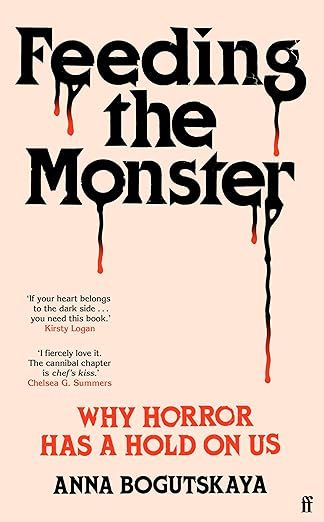

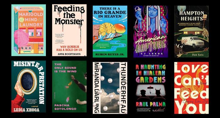
Feeding the Monster by Anna Bogutskaya, design by Henry Petrides
It is the complete lack of a grounding image on the cover that makes this one really sing. We know it’s about horror from the title, which takes up about a third of the cover’s real estate. But it’s the drips from those letters and the classic horror film font of the subtitle and the author’s byline that give this cover a complete feel. Sometimes the simpler, the better. This cover won’t be easily, if ever, dated. (I get some serious Helter Skelter energy here, too).
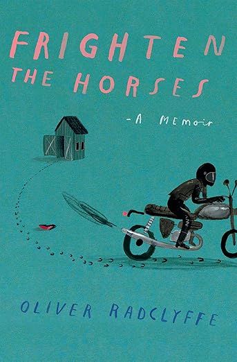

Frighten The Horses by Oliver Radclyffe, Cover art by Oliver Jeffers
Without seeing “A Memoir” beneath the title, you would have no idea. This cover has nothing indicating that it’s a true story, and that’s one of the reasons this cover is so distinctive. The other is that the art is by Oliver Jeffers, a well-known and beloved children’s book illustrator. It’s simplistic in execution, but that’s what makes it pop. This looks like no other memoir, let alone an adult novel, on the market right now.


Hampton Heights by Dan Kois, design by Olivia McGiff
How much is going on here? A lot.
How much does all of that “a lot” work together? A lot.
This is a book that by cover alone, I want to read. We’ve got werewolves, monsters, a sketchy van, a fast food joint, and a full moon, with a tagline/description of the book with its title. Despite what it sounds like, this is a work of fiction and not an actual night in Hampton Heights, Milwaukee. The descriptions of this one confirm what I get from the cover itself: this is one for readers who love Stranger Things or Stand By Me…and maybe one of my favorite works of horror that is deeply under appreciated, The Saturday Night Ghost Club.
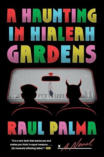

A Haunting in Hialeah Gardens by Raul Palma
While the original hardcover art for Palma’s novel is good, it’s not as strong and evocative as the paperback edition out now. Here, there is a vintage and slight nostalgic feeling in the varied color usage in the title and author. The devil sitting beside our main character, thinking about what the future may hold—is that a movie screen they’re staring at or is it them in the front seat of a car—invites the reader in.
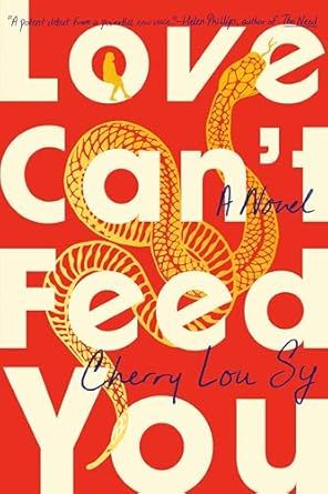

Love Can’t Feed You by Cherry Lou Sy
It is such a bummer that Sy’s publisher—the same one as Palma’s above—does a fantastic job of sharing book covers on their Instagram but fails to include any cover art or design information with it.
There’s something about the use of cream in this batch of fantastic book covers that’s working. In the case of this one, it’s the font of the title-driven art. It’s uneven in its sizing, looking almost like it wants to fall off the cover, and intertwined cleverly is not only a golden snake but a person looking onward, either ready to jump off or who is simply taking a break to enjoy the scenery. That the person is so much tinier than the snake is a wonderful little detail, and the darker script font for Sy’s name is the cherry on top.
This shakes up the trend we’ve seen over the last decade of really focusing on the title for design and the overuse of the snake motif.


Marigold Mind Laundry by Jungeun Yun, Cover by Holly Ovenden
This Korean bestseller is one of my all-time favorite book covers, period. It’s utilizing color very well, but that’s not what works. It’s the design in the shape of a laundromat vending machine detergent box and it literally pops with its three-dimensional placement. We have both a look at the outside of the laundry mat, with its empty space and empty machines, juxtaposed with the outside and a vibrant pink tree. Then we have the clothes hanging in the upstairs window. Where this could feel like an isolating image, it feels instead cozy and comfortable—like the kind of cozy read you want to pick up and have a good time with.


Masquerade by Mike Fu, Cover design by Beth Steidle
Contrast, contrast, and more contrast. That’s what makes this cover work so well. There’s nothing especially genius happening here, but it’s the way the white text pops on the black because of the use of marigold and red. Generally, white text on black can be difficult to read, especially on a screen, but here, the other colors and simplistic shapes make it work.
It’s clever, too, how the flowers in what is presumably the sunlight are able to be a different color and showcase far more detail. Masquerade indeed.
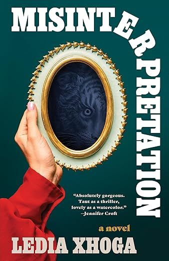

Misinterpretation by Ledia Xhoga, Cover design by Beth Steidle
Beth Steidle twice in a row—I fell down her Instagram account after seeing this cover right after the Fu cover in looking up who was behind their art. When you look at this cover and the one above, you definitely see her perspective and take on jacket design. The fonts are bold but not overpowering, ensuring the design itself is the focus and not the letters…and yet the letters don’t disappear, either. Bold color and contrast make these really stand out on screen and on shelf. The image in the mirror here is easy to miss on the first view, but the more you look, the more there is to love (I want to say “Misinterpretation indeed” here, like in the previous rad Steidle cover above!).
Steidle is going to show up again shortly. She’s on a roll this season.
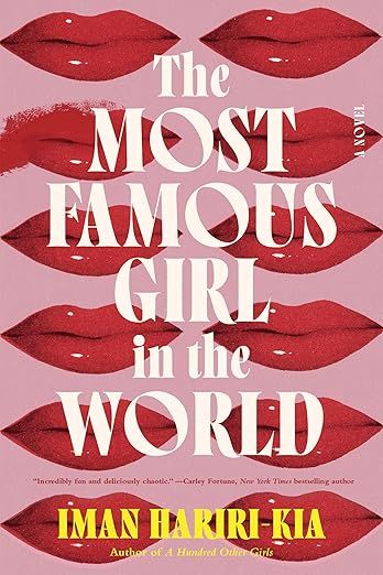

The Most Famous Girl in the World by Iman Hariri-Kia, Cover art by Emily Mahon and design by Brittany Vibbert
What do 12 pairs of red lipsticked mouths have to do with the most famous girl in the world? That’s what draws me in, but what keeps me is that the second set of lips from the top on the left is not perfect like the others.
The font has a very vintage feel, as does the color palate. It’s desaturated, and the title itself fades into the background in a way that actually makes you really pay attention to the words.
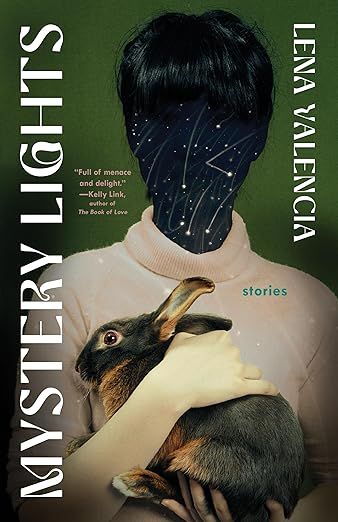

Mystery Lights by Lena Valencia, design by Beth Steidle
I promised Steidle’s art would be back. Look at the use of the large font here, and look, too, at how it is aligned on the cover. You almost forget about it because the central image is just that: central. But you can’t overlook them either because the choice in font makes the title and byline memorable. The background is the perfect moody green to boot.
Rabbits on book covers are a thing I will always be drawn to, and in the case of this cover, it reminds me a lot of the bunny on Rabbits For Food by Binnie Kirshenbaum.
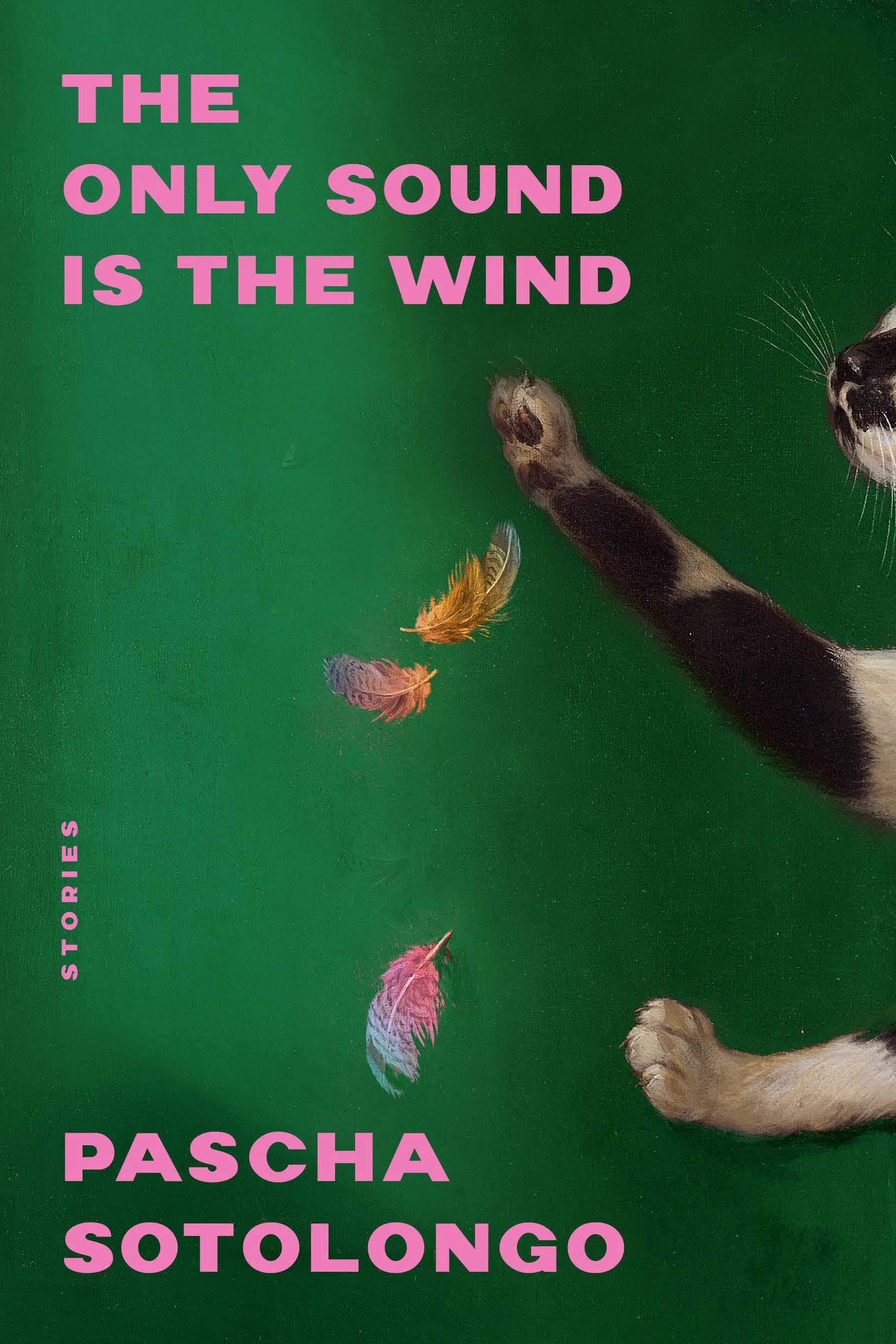

The Only Sound Is The Wind by Pascha Sotolongo
There’s a fun piece that came out earlier this year talking about one of the recent cover trends for adult books being “old timey animals.” I’ve seen this too, and I think this is one of the covers that neatly fits into that category. Much as I love a cat on a cover, this one is unique in that we get a sense of what has already happened. That cat had itself either a surprise meal or was playing a little aggressively with a brightly feathered friend.
The image is great, but it’s the thick pink font choice for both the title and author that sing against that deep green background. If there’s a color working in 2024 quarter three book covers, it is shades of emerald.
This book cover also advances my thesis that short story collections consistently get some of the most compelling and evocative designs in adult literature.


A Reason to See You Again by Jami Attenberg, design by Allison Saltzman
The vintage style and imagery just works here. I love the candy pink phone against the faded blue-green background with that creamy font for the title and byline. I will say there is one little thing I dislike—a tiny, tiny bit more space between the top of the phone receiver and the “n” in Again would have packed even more visual punch.
There’s a reason this particular phone works in this particular cover. It’s the spiral cord, which adds not only a dimension of texture to the otherwise pretty basic and flat image, but it adds movement, too.
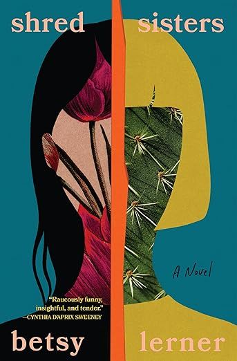

Shred Sisters by Betsy Lerner
Sisters evokes, well, sisterhood and all of the warmth that a relationship can encompass. Shred, however, does the opposite. So what makes the most sense for a book title that is both sharp and warm? You get a cactus on one side and a deep colored blood on the other side. This cover tells a whole story in and of itself.


Suggested In The Stars by Yoko Tawada, translated by Margaret Mitsutani
At once you think this is going to be a color blob cover. That the yellow and bright blue are meant to do the work of telling the reader to pick it up. But then you get the photo dead center in a colorway that contrasts the background and more, the image itself tells the reader nothing. Why is that person touching their mouth? Or almost touching it, really? The smooth chin juxtaposed against the jagged background is jarring, as is the fact both the title and author font is tiny and without much weight.
In many ways, this is not a good cover by design standards. But it’s also perfect because it knows the rules and immediately breaks them all.


There Is A Rio Grande in Heaven by Ruben Reyes Jr., Cover by María Jesús Contreras
This cover immediately makes me think of several others that use the reflection of a shiny object like a knife or a rear view mirror to showcase the eyes of a person just off the cover, such as Priya Guns’s Your Driver Is Waiting, The Perfect Girl by Tracy Banghart, and Ellie Marney’s None Shall Sleep.
Not only is the book title sharp and memorable, there are so many elements going on in this hyper-illustrated image that it is hard to stop looking and noticing. The mango crying a river that also looks like the reflection is crying! The movement of what is presumable the Rio Grande here! The funky fingers on that hand (it looks like two thumbs but is not!). The colors are all singing in unison even though they don’t especially blend. It’s another classic example of “these are not supposed to work together but they do!”
Also: it’s short stories.
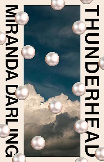
Thunderhead by Miranda Darling, Cover by Luke Bird
Last and certainly not least is Thunderhead which, like Mystery Lights, takes advantage of vertical orientation for both the author byline and title. The design here could be pretty memorable with just that, alongside the thunderhead cloud in the center. But the superimposed pearls take this from being a realistic looking cover to one that has some kind of magical or strange vibe to it…in a good way! The imperfect placement is reminiscent of a shattered necklace whose beads have scattered across the floor.
Could a cover for a black comedy about a suburban woman itching to get the hell out of her boxes be any more appropriate? (Also a moment to appreciate what an incredible name Miranda Darling is!).
Never fear, either. If you’re wondering about books published in November and December worthy of being highlighted in a best cover round up, keep your eyes peeled. They’ll be covered (heh) before the end of the year here, too. Perhaps there’ll even be a poll for you to drop your favorite book cover from 2024, too.

